How to Use the Line Chart Visualization
Use the Model Options form to select parameters for the projection you want to view. Select a to learn more about each option. Select Show to display the projection.
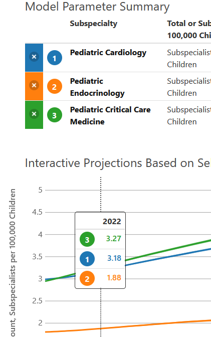
You can display multiple lines at once to compare projections - just change your options and select Show again. You can also delete individual projections by clicking the X button to the left of each projection in the Model Parameter Summary. Or you can clear all projections by clicking the Clear button.
You can also add multiple projections at once by selecting the option that specifies "Separate".
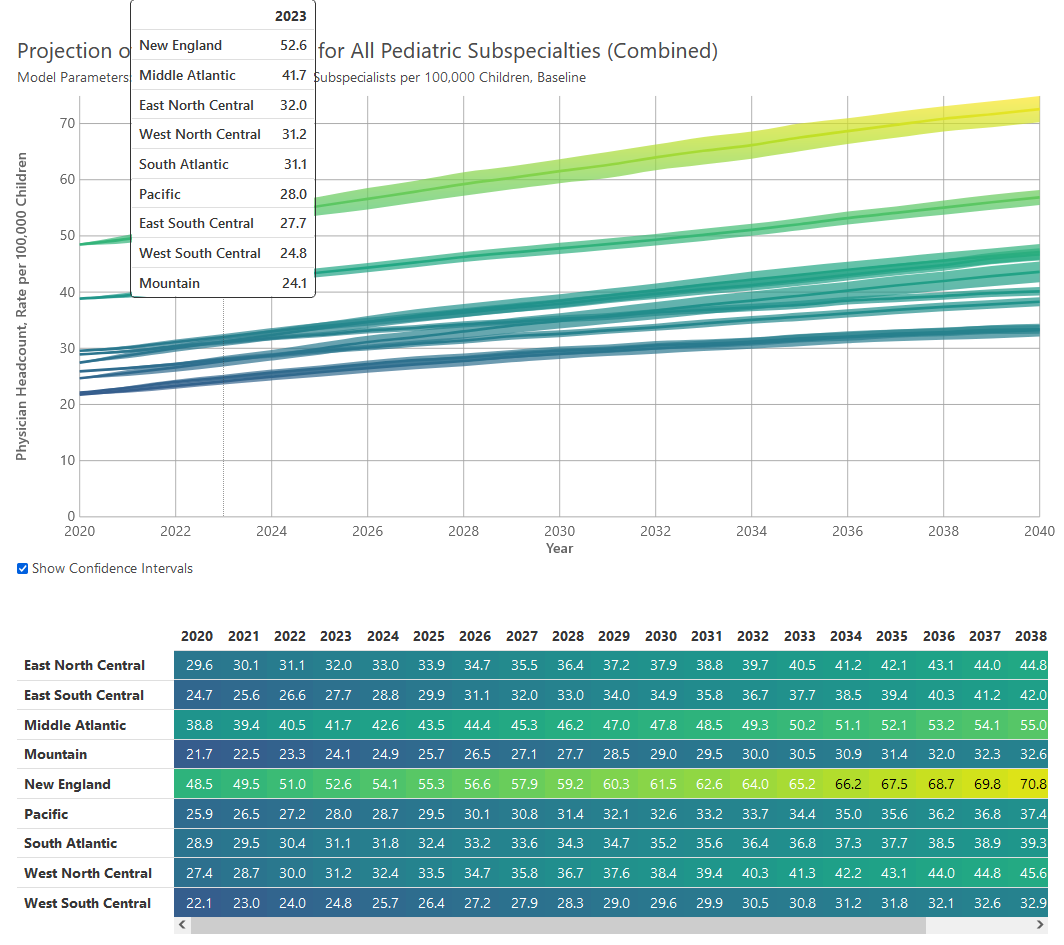
Hovering in the chart area displays the values associated with each projection for a given year. The number circles correspond with the number circles in the Model Parameter Summary.
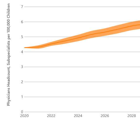
The area around each projection line represents the confidence interval. The interval will be larger for smaller subspecialist populations and for projections further in the future.
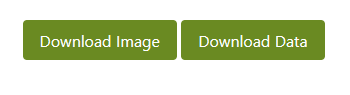
You can download an image of the chart or the data underlying the chart as a .csv file by clicking one of the download buttons.